Showing posts with label Bathroom. Show all posts

Thursday, 17 November 2011

Specific Point of interest

The shower in the en-suite bath room is to be made bespoke to fit the width of the room.  Below are detailed drawings of this area and what it should look like.

A low wall either side of the door will provide a shelf on the inside of the shower, and will be made from wood.  Glass panels will then be fitted and sealed above the wall to form part of the screen.  The image below gives an example of the type of glass I will be using here.  Continuous with the theme, this reflects the natural surroundings, and in particular the wild flower garden.

(Ebcu, n.d.)


The door will be made from clear glass, and sit centrally to the shower.  The tiles I have chosen are from La Fabricca S.p.a, and reflect the wild garden, with flowers that look as though they are blowing in the wind.  Below are some larger images of these tiles.

La Fabbrica. (n.d.)

La Fabbrica. (n.d.)

La Fabbrica. (n.d.)

These images are from the company website, and show the tiles with the flowers at the top.  In my design, I will use them the other way up to give the impression they are growing up from the ground.


Post Bibliography

Ebcu. (n.d.) Decorative Glass [Online] Available from: http://www.ebcu.com/p-decorative-glass-1067750.html. [Accessed: 16th November 2011]

La Fabbrica. (n.d.) Cathy 4 Fine. [Online] Available from:http://www.lafabbrica.it/upload/pdf%20collezioni/cathay%204fine.pdf. [Accessed: 10th November 2011]

Friday, 11 November 2011

Bathroom - From Theory to Concept

 Having looked at the theories of High Modernism and Truth to Materials, I have used these theories to develop the following concepts for the en-suite bathroom.  These I have shown below.

Truth to Materials
This concept has been formed using only natural materials.  These materials have not been treated or painted to resemble anything else.  Wood and stone are the predominant elements, however natural fabrics such as linen and cotton have been included to show how the theory can be applied to the whole concept.

High Modernism
High modernism looks at making internal structures external.  Here I have created a concept that takes external structures and makes them internal.  This has led to some interesting feature pieces such as the sink stand and flower relief tiles.  As stated in the brief, the window in this room looks out over a garden full of wild flowers and birds.  Although this theme draws on this, and is an original concept, I need to bear in mind factors such as ease of cleaning and practicality.  It is for this reason that I have created a third concept, shown below.

Truth to Materials and High Modernism
This concept combines the two theories that I have looked at, with truth to materials furniture and fabrics, but also incorporating the idea of external natural structures.  In one of my previous posts, I also explored the idea  of external colours, which have also been incorporated into this concept.  I feel that combing the two theories and concepts has produced a practical concept that meets the original brief.  The wallpaper, fixtures and tiles connect the outside view, while the sink stand and bookcase give the room a continuing natural connection.

Furniture and Fittings Choices

Sink stand - The marble and wooden frame work incorporates the truth to materials theory, the sink which is not strictly true to the original source will be easy to clean, an important consideration.  The toilet is also ceramic, and so tis will link the two together.

Storage Unit - The client needed storage for towels, spare toiletries and ornaments.  This bookcase had two draws for storing away items such as toilet rolls and spare toothpaste, and plenty of open shelving for towels and ornaments.  Although the piece does not exactly match the sink stand, it is true to its material, and as not all natural materials perfectly match, I do not feel this is a problem.

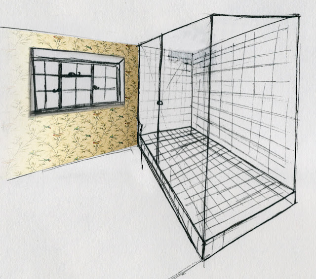
Wallpaper - This has a direct link to the view from the window, and will be pasted on the wall containing this window as it is a large wall, and can be seen from the hall and bedroom, adding interest.  The plants that the birds are perched on represents an external structure.

Application of wallpaper


Tiles - The tiles reflect the wild garden outside, and the flowers that are all jumbled in together.  Although here it is shown with the flowers at the top, I will be putting the flowers at the bottom, to give the impression they are growing and blowing away in the wind.  This I feel will look more natural.  Matching plain tiles will line the floor in the shower and the main bathroom, but will be rough, to avoid slipping.

Fittings - The towel rail and toilet roll holder are a direct link to the wallpaper and the outside, and have been chosen for their finish and practicality.

Toilet - This period style piece reflects the age of the house, and suits the rest of the concept, as opposed to a modern style which did not fit in.  As previously stated, the material also matches the sink.

Wooden Skirting Board - This is to tie in the furniture and the painted walls, and to add a better finish to the bottom of the wall.  Natural wood also reflects the truth to materials theory.

Natural Linin Blind - For privacy, I will use a roman blind, instead of curtains.  I have chosen a non patterned fabric so that it does not detract from the busy wallpaper, and as this does not represent the high modernism theory, I have applied the truth to materials theory, choosing a natural linen.

Shower Head - Similar to the toilet, i have chosen a more traditional shower head, as this works well with the rest of the concept.  It also matches the metal taps on the sink.


Thursday, 10 November 2011

Truth to Materials in the Bathroom

The house contains many natural resources such as a stone fireplace, and wooden beams.  To create a design that works seamlessly with this, I would like to continue this throughout the rest of the house.  Stone tiles demonstrate the truth to materials theory I have been researching, and so in this post, I have done some initial research. 


The large glass screen shows off the stone surround.  the tiles on the floor give the space dimension, as they are smaller, but the colour still works well with the wall tiles.  They also stop the space blending into one and looking flat.


These tiles look much more geometric and darken the space.  The room I am designing has one long window, and so is a very light space.  This means that it can take the darker colours, however I do not like these particular tiles


This is an example of how very light natural colours have been used.  To me this makes the bathroom look very washed out. there is also very little varying textures so the room has no depth or interest.


This is an example of how other natural textures have been used in a bathroom, demonstrating truth to materials.  I like the wooden sinks, and so I now have another direction to research.  I also like the rustic towel rail, as it works well with the natural look of the room.


These stone tiles are by a company called Lafabbrica Spa.  These combine the idea of truth to materials, but also include an external structure in the design.  The bathroom looks out over a wild flower garden, and so using these tiles would be a direct connection with the outside.


Monday, 7 November 2011

Final Floor Plans - Agreed by Client

These are the final floor plans that have been agreed by the client.  Under each one is a despcription of the alterations and areas of development.

Drawing Room

  • Here I have extended the console table to fill the wall space.  This also means that two table lamps can be placed on the table, without obstructing the curtains
  • I have made the armchair smaller, and so a small chair will need to be looked for
  • I have also added a small round side table 
  • The side table next to the sofa has been made larger.  A longer table was tried which did fill the space better but looked too cluttered

Kitchen

  • I have chosen to include a breakfast table instead of an island for two reasons.  Firstly because it is more traditional, and secondly because I did not wan't anything obstructing the view out of the double doors.
  • I have removed both the windows from the one wall, and centred double doors along the wall instead.
  • The fridge has been moved out from under the stairs, and although it is not in an overly prominent position, it is not obstructing anything, and this seems to be the best place
  • The external door opposite the stairs has been moved to allow the cupboard doors to open easily.
  • The door at the bottom of the stairs is not new, but was not drawn into previous drawings as it should have been.

Bedroom and Bathroom

  • The main change is that the client has now decided that they do not want a TV in the bedroom, as they feel it ruins the ambience of the space. 
  • In place of the TV I have added two wall lights and a mirror to create a dressing table area.
  • Nothing else has been changed in this room
From these drawings I can now construct a furniture list for each room and begin to choose furnishings.

Sunday, 6 November 2011

Bedroom and Bathroom Floor Plan Options

Lastly, the bedroom and bathroom floor plans were presented to the client.  These were presented as one drawing to demonstrate the alterations to the bathroom stud wall.  These are as follows:


Drawing 1 - Client Feedback
Positives
  • Plenty of wardrobe space, and a chest of drawers
  • Moving the bathroom door allows a larger piece of furniture to be put along that wall
Drawbacks
  • Bedroom looks crowded
  • Bed not centred to chest of drawers which looks unblanaced
  • End wardrobe door is obstructed by side table
  • Bathroom has been turned into an 'L' shape making it look smaller
  • Effectively have to walk down a corridor to get to toilet
Drawing 2 - Client Feedback
Positives
  • Plenty of space in bedroom
  • Large chest of drawers provides lots of storage
  • Bathroom layout works well, moving the wall and door creates more space in bedroom, but layout of bathroom means it does not look any smaller
  • Sink overlooks garden
Drawbacks
  • Bed is in view of the doorway, making it feel exposed
  • Bed not centred with window making it look unbalanced 


Drawing 3 - Client Feedback
Positives
  • Lots of wardrobe space
  • Like the area created for television
  • Good space around the bed
Drawbacks
  • Bathroom looks narrow, drawing 2 had a better arrangement
  • Ceiling where built in wardrobes have been drawning is sloped so may not be able to get full height
  • Dressing table looks a bit lost
Drawing 4 - Client Feedback
Positives
  • Lots of wardrobe space
  • Like the chest of drawers opposite the bed for the television
  • Nice touch to have a bedroom chair
  • Bed is fully integrated into the room, so does not feel exposed
  • Good bathroom layout, maximising the space (same as drawing 2)
  • Bedroom furniture layout makes the room look balanced
Drawbacks
  • Sink does not have a mirror above it, however it does look out over the garden
Thumbnail sketches to give a rough idea of what each one might look like in 3D


Looking at the feedback from the client, there is a clear favourite.  drawing 4 seems to tick all the boxes, and only has one minor draw back, however the client does not seem to have too much of a problem with this.  The bathroom layout from drawing 2 and 4 works well, and maximises the space in the bedroom.
The aim of this presentation was to choose a drawing to develop, however the client seems perfectly happy to keep drawing 4 as it is.